03 Jun 2026
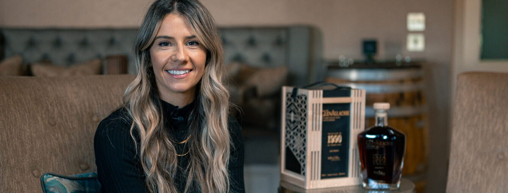
Q&A WITH KAYLEY BARBOUR: DESIGNING THE GLENALLACHIE 1990
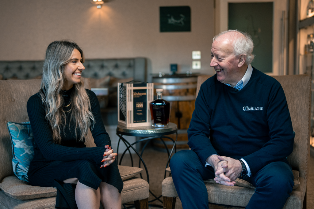
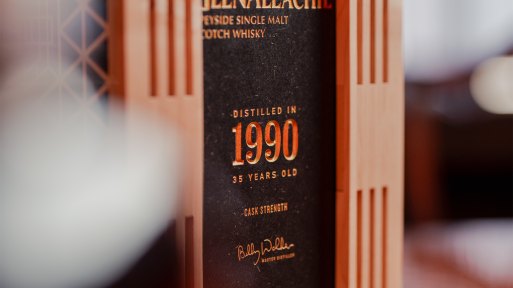
The GlenAllachie 1990 / 35-year-old Cask Strength Single Malt Whisky stands as the pinnacle of our collection. Working closely with Master Blender Billy Walker as The GlenAllachie’s Brand Design and Innovations Manager, Kayley Barbour was instrumental in bringing this exceptional whisky to life – guiding the project from conception to completion. We sat down with Kayley to explore the journey behind it and the inspiration that shaped its creation.
How did you want people to feel when they first see this whisky?
I wanted it to feel special, but not loud. There’s a lot of ultra-premium whisky packaging that leans heavily into excess, and that didn’t feel right for this. Instead, I wanted a sense of curiosity and anticipation, something that reveals itself gradually. The outer structure gives you that first moment of intrigue, and then as you open it, the story unfolds.
Before we get into the design – what makes this whisky different?
This one is really about Billy Walker as a person. The first GlenAllachie 35-year-old we released in 2024 celebrated his legacy and his reputation for rich, sherry-led whiskies that people instantly recognise after more than 50 years in the industry.
But the more I worked on this project, the more I realised what actually brings him joy is innovation. He loves experimenting, pushing boundaries, working with different cask types. So that’s where the idea came from, creating a 35-year-old that reflects his creativity, not just his legacy.
Introducing Japanese Mizunara casks into a whisky of this age is a huge risk. It’s a notoriously difficult oak to work with as it’s highly porous, but that challenge and unpredictability felt like the perfect way to represent that side of him.
Walk us through the key design elements?
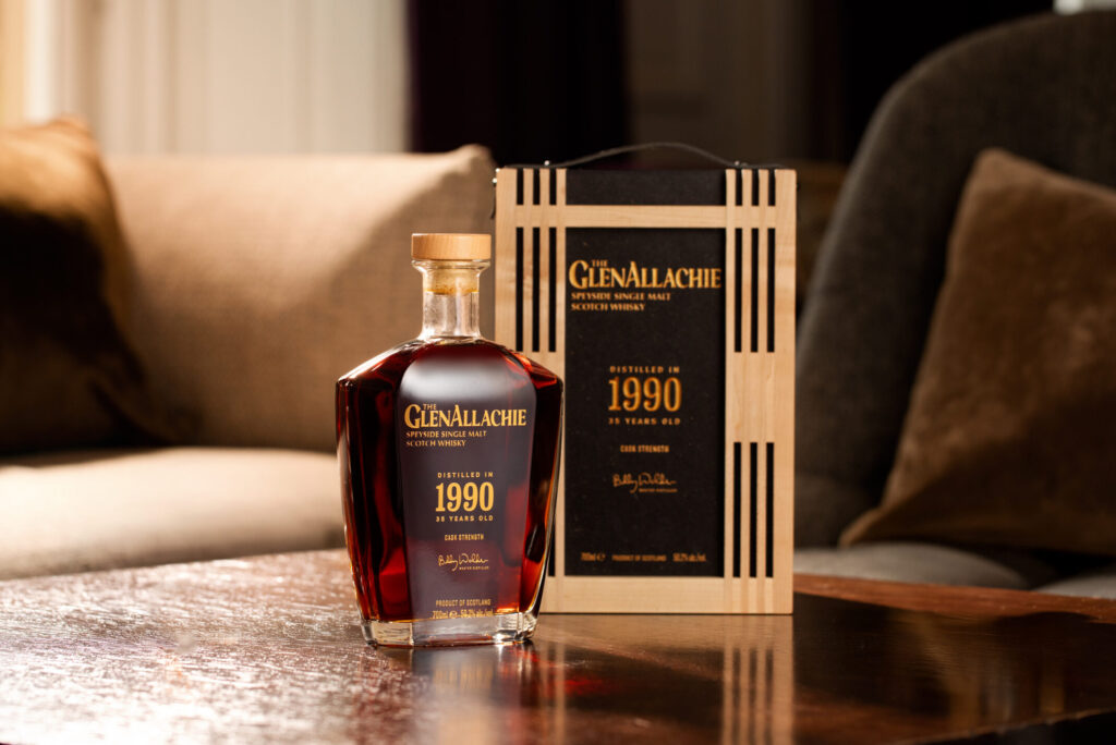
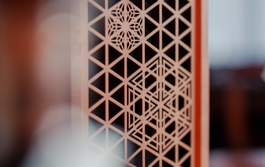
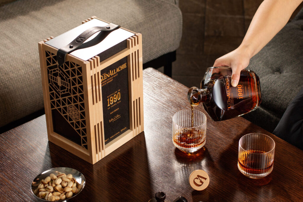
The whole design is built around a dual-structure concept, two parts that come together to tell one story.
The inner box represents tradition. It’s made from Valchromat which is a recycled wood material with this beautiful, natural speckled finish. It almost looks like stone which ties back to our name, GlenAllachie, which means “Valley of the Rocks”, then the speckle ties into all our core packaging.
The outer structure is all about innovation. It’s inspired by Kumiko, a traditional Japanese woodworking technique that interlocks thin wooden strips to create intricate, geometric patterns without nails or glue. I worked closely with Moran’s Wood Components to reinterpret this style using precision cutting instead of traditional joinery.
The sides of the box feature different patterns representing each of the four cask types in the whisky, and there’s also a subtle reference to the distillery’s gable end worked into the structure. It’s quite layered, but still feels clean.
How did the liquid inspire the design?
It really came back to that balance of tradition and experimentation. You’ve got a 35-year-old spirit, something incredibly rare and established, but then it’s been pushed in a new direction with Mizunara oak.
So the design mirrors that. The inner box is more grounded and timeless, while the outer structure feels lighter, more intricate and a bit unexpected. It’s about tension between those two ideas.
What was the biggest design challenge you faced?
Definitely the outer structure. Kumiko is traditionally handcrafted, so translating that into something repeatable without losing the delicacy was a challenge. The lattice had to feel light and intricate, but still be strong enough to protect the bottle. I also wanted to use the outer box to represent the whisky as a whole and not just the Mizunara oak, I still wanted it to feel like GlenAllachie. There was a lot of work in getting the balance right both creatively and structurally but thankfully Moran’s are a great team to work with and helped bring my visions to life.
How did you balance design with the distillery’s sustainability initiatives?
It was less about adding sustainability features and more about designing responsibly from the ground up. Material choice played a big role, using Valchromat for the inner, a coloured-through recycled wood, and natural maple wood for the outer, meant we could avoid lamination, magnets, and heavy paint finishes altogether.
We also made sure every element had a purpose. The dual-structure design isn’t just aesthetic, the outer shell acts as both protection and display, enhancing visibility and storytelling without adding unnecessary materials. It’s about achieving a premium experience in a more considered, efficient way.
What are you most proud of in this design?
I think it’s how everything connects back to the story. Nothing feels decorative for the sake of it, every detail has a reason, whether it’s the materials, the structure, or the patterns.
But more than anything, I’m proud that it captures a different side of Billy. Not just his legacy, but his curiosity and willingness to take risks. That’s what makes this release feel really special.
Find out more about the whisky here. The GlenAllachie 1990 / 35-year-old Cask Strength is now available at our distillery shop, online store, and at our specialist retail partners worldwide.